Beyond Stock Assets: Crafting Consistent 3D Icons Using AI
Published on
Reading Time
2 mins
In the world of UI/UX and brand building, consistency is king. As designers, we’ve all been there: you find the "perfect" 3D icon for a landing page, only to realize the rest of the set is missing, or the lighting on the "Contact" icon doesn't quite match the "Home" icon.
Standard icon libraries often fall short when you're aiming for a highly specific aesthetic—like 3D Glassmorphism. In my latest project, I decided to bridge this gap by using AI not just as a generator, but as a precision tool to create a perfectly synchronized icon set.
The Problem: The "Mixed-Bag" Aesthetic
When designing a modern website, visual friction—where elements feel slightly "off" from one another—can ruin the user experience. Finding a set that matches a specific futuristic, translucent glass style with precise color gradients (like the blue-to-pink transition I used) is nearly impossible on stock sites.
The Solution: Reverse-Engineering the Aesthetic
Instead of searching for hours, I used a workflow that leverages the analytical power of AI to replicate a specific "Visual DNA."
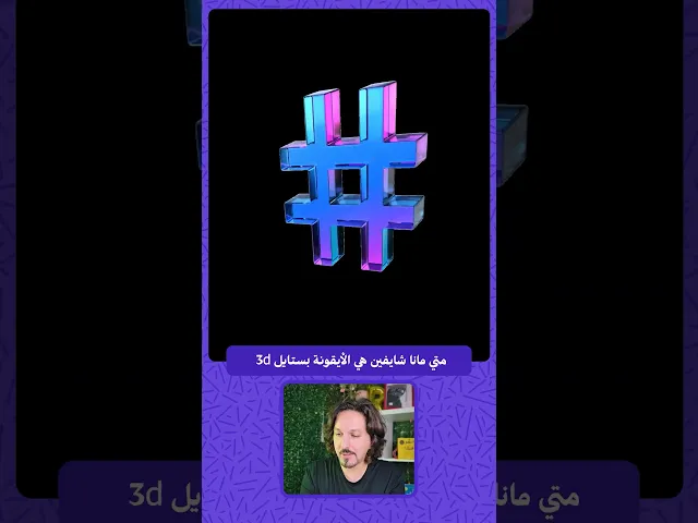
1. Establish the "Hero" Icon
I started with a single reference image that captured the exact look I wanted—a 3D hashtag symbol with glossy, beveled edges and a vibrant neon gradient.
2. The AI "Interrogation"
I uploaded this reference to ChatGPT with a specific prompt: "Write a detailed English prompt that describes the exact style, lighting, material, and rendering of this image."
3. Decoding the Visual DNA
The AI provided a technical breakdown, identifying key descriptors such as:
Material: Polished acrylic/translucent glass.
Lighting: High-contrast studio lighting with gentle reflections.
Edges: Smooth beveled edges with a futuristic neon glow.
4. Mass Production with Precision
With this "master prompt" ready, the process became effortless. By simply swapping the subject name (e.g., changing "Hashtag" to "Telephone," "Instagram," or "Mail") while keeping the rest of the description identical, I generated a full suite of icons that look like they belong to the exact same family.
Why This Matters for Modern Design
Absolute Consistency: Every icon shares the same light source, camera angle, and material properties.
Efficiency: You can bypass the hours required for 3D modeling and rendering in software like Cinema 4D or Blender.
Brand Uniqueness: These assets are custom-made for your project, ensuring your UI doesn't look like a template.
A Tip for Creative Directors
When using tools like Midjourney, DALL-E, or Gemini, the secret lies in the adjectives. Using terms like "Octane Render," "4K high-fidelity," and "Cyberpunk-inspired aesthetics" helps the AI understand the technical quality you expect.
Check out the video above to see the step-by-step process and the final icons in action!