DISCOVER PROJECT
Pinnacle Strategy
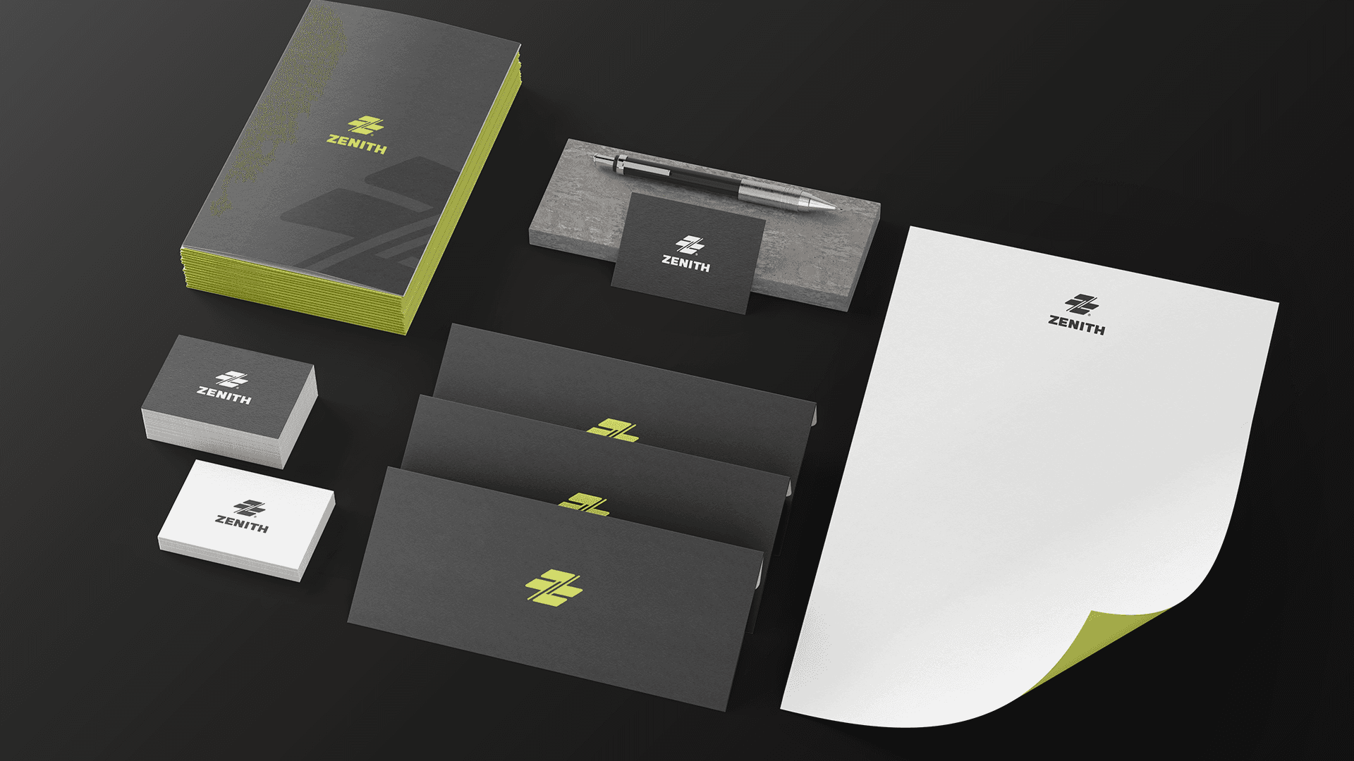
Pinnacle Visual Identity
Where proactive vision meets analytical precision to shape the future of decision-making.
2024
In an era of data overload, the true competitive advantage lies not in having information, but in the wisdom to navigate it. Pinnacle Strategy was born to serve as the compass guiding enterprises toward their peak. We don't just offer consultations; we engineer sustainable growth paths by blending creative strategic thinking with cold, hard logic—transforming complex environments into clear, actionable opportunities.
SERVICES
Logo Design, Visual Identity Design


The Challenge
The objective was to craft a visual identity that bridges the gap between "rigid" data and "fluid" strategic thinking. The challenge lay in creating a symbol that commands authority and trust while maintaining the spirit of innovation and agility that defines the firm’s methodology.
4. Logo Concept (Design Philosophy) The Pinnacle Strategy logo is a geometric manifestation of the firm’s core philosophy, strategically merging three vital elements: The Knight Move (Strategic Symbolism): Integrated within the structure of the letter 'P' is the silhouette of a chess Knight. Representing the only piece that moves in a non-linear path, it symbolizes Intelligent Maneuvering and the ability to bypass obstacles in complex environments. Data-Driven Insight: The base of the logo features tiered diagonal lines resembling Data Bars. This reflects the firm’s commitment to strategies rooted in rigorous analysis and numerical evidence rather than mere intuition. The Letter P & The Pinnacle: The outer frame forms the letter 'P' (The brand’s initial), while the upward curvature and rising lines evoke the sense of growth and reaching the Pinnacle of success.
Color Palette

The visual language uses a palette designed to communicate "Modern Authority": Digital Emerald (#141f57): Symbolizes vitality, sustainable profit, and the strategic success we aim to achieve for our clients. Deep Charcoal (#fdcd6e): Reflects power, prestige, and seriousness—positioning the firm as a trusted entity in high-stakes decision-making. Cool Grey (#a3a3a3): Provides a balance between strength and modernity, adding a touch of professional elegance. Typography: We utilized clean, geometric sans-serif fonts to mirror the transparency and precision inherent in the firm's consultancy reports.


Where proactive vision meets analytical precision to shape the future of decision-making.


The Result
The final result is an exceptional visual identity that transitioned Pinnacle Strategy from a consultancy firm to a premier brand synonymous with intelligence and trust. This design provides the firm with a visual "voice" that tells a story of success before a single word is spoken, solidifying its position in the competitive landscape of strategic studies.
Michael Levinson - CEO of EcoGrid Technologies